A Boutique Hotel in the Sky:
WeWantMore Rebrands Brussels Airlines
May 30, 2025
Antwerp / London, March 2025 — Brussels Airlines and design studio WeWantMore have unveiled a renewed brand identity that finally brings the warm, personal character of Belgium’s national airline to life across every stage of the travel experience. Not a logo change, not a classic rebrand—yet a profound transformation of the brand’s expression.
From Corporate to Characterful
In 2021, following the difficult COVID period, Brussels Airlines introduced a new visual identity. But despite that effort, one key challenge remained: the brand experience still felt distant and overly corporate. Without a cohesive design system to carry its story, the airline struggled to convey its signature Belgian charm, approachable premium feel, and onboard hospitality. Visually, it also lacked distinction in a crowded landscape of interchangeable airline branding.
The Shift: From Looks to Feeling
In close collaboration with WeWantMore, Brussels Airlines redefined what an airline brand should look and feel like—without touching the logo or color palette.
Anchored in the brand essence “You’re in good company,” the concept “Small details. A world of difference.” brings that promise to life.
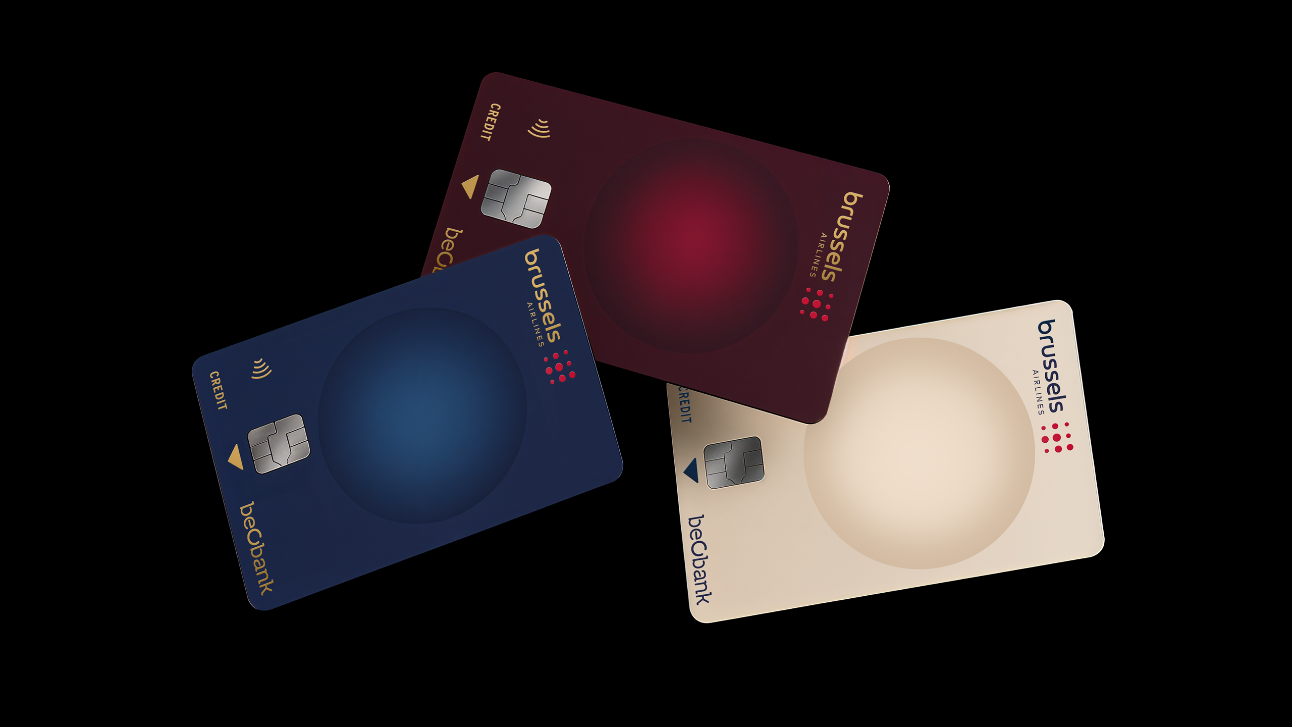
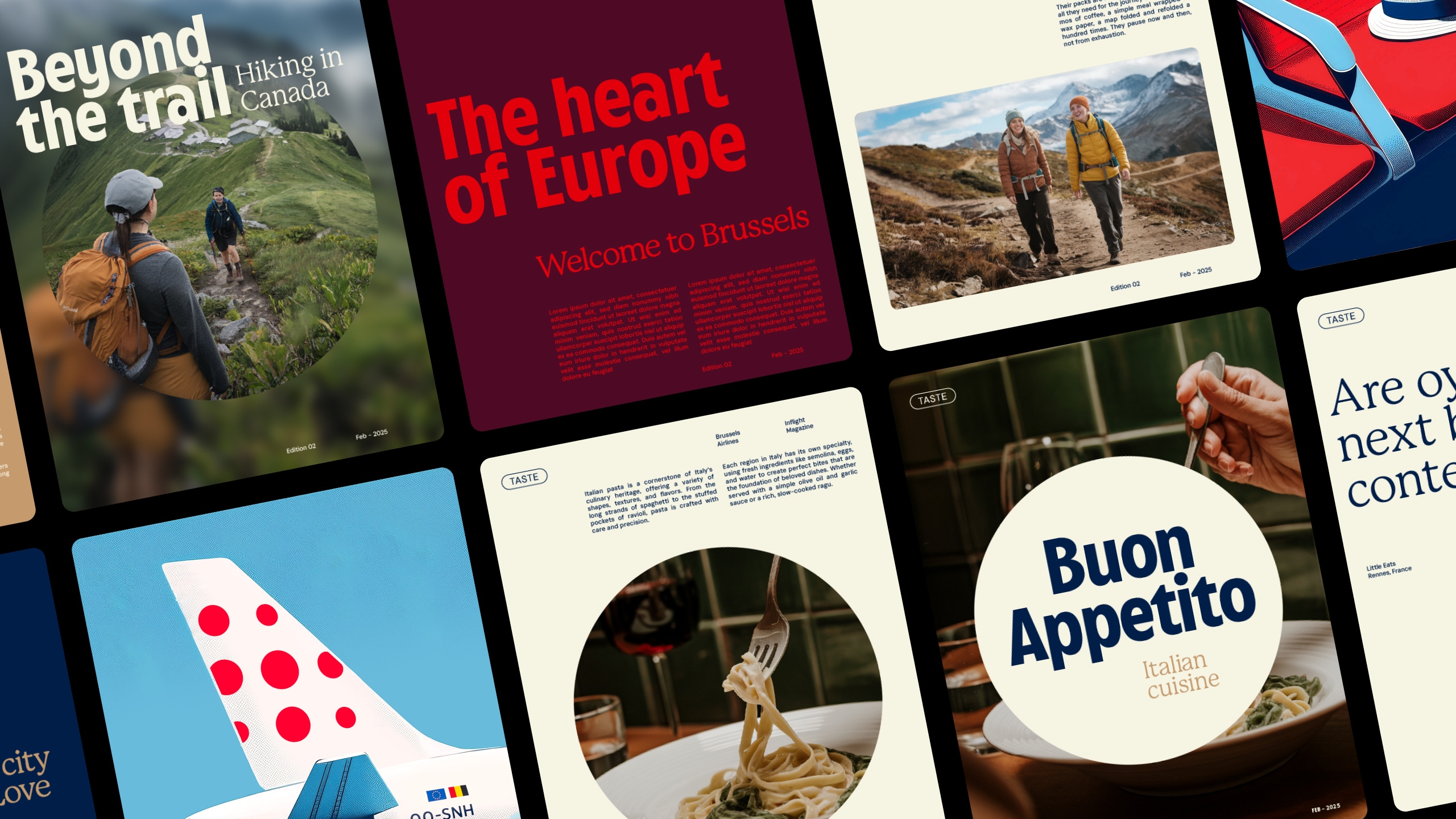
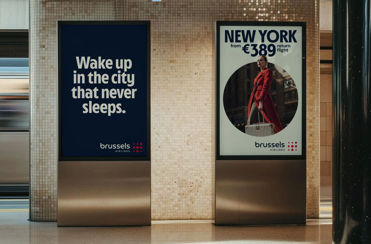
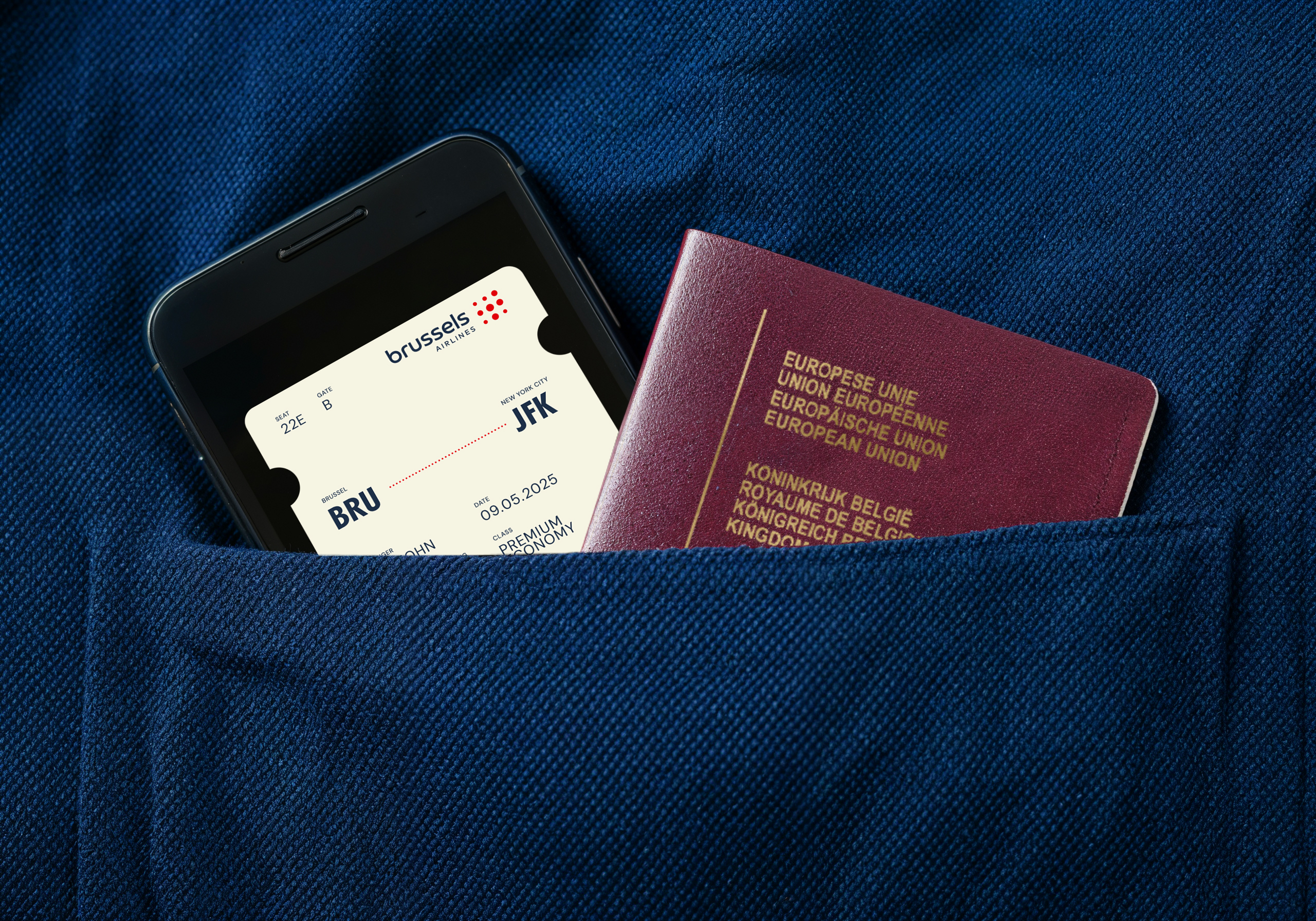
Rather than relying solely on the polkadot logo, the new identity introduces a single dot as a guiding visual cue—a fresh signature that draws the eye toward the small gestures that make a big difference. WeWantMore also created a custom typeface, Cirrus Sans, inspired by the golden era of aviation, and subtly enriched the color palette with warmer, more premium tones.
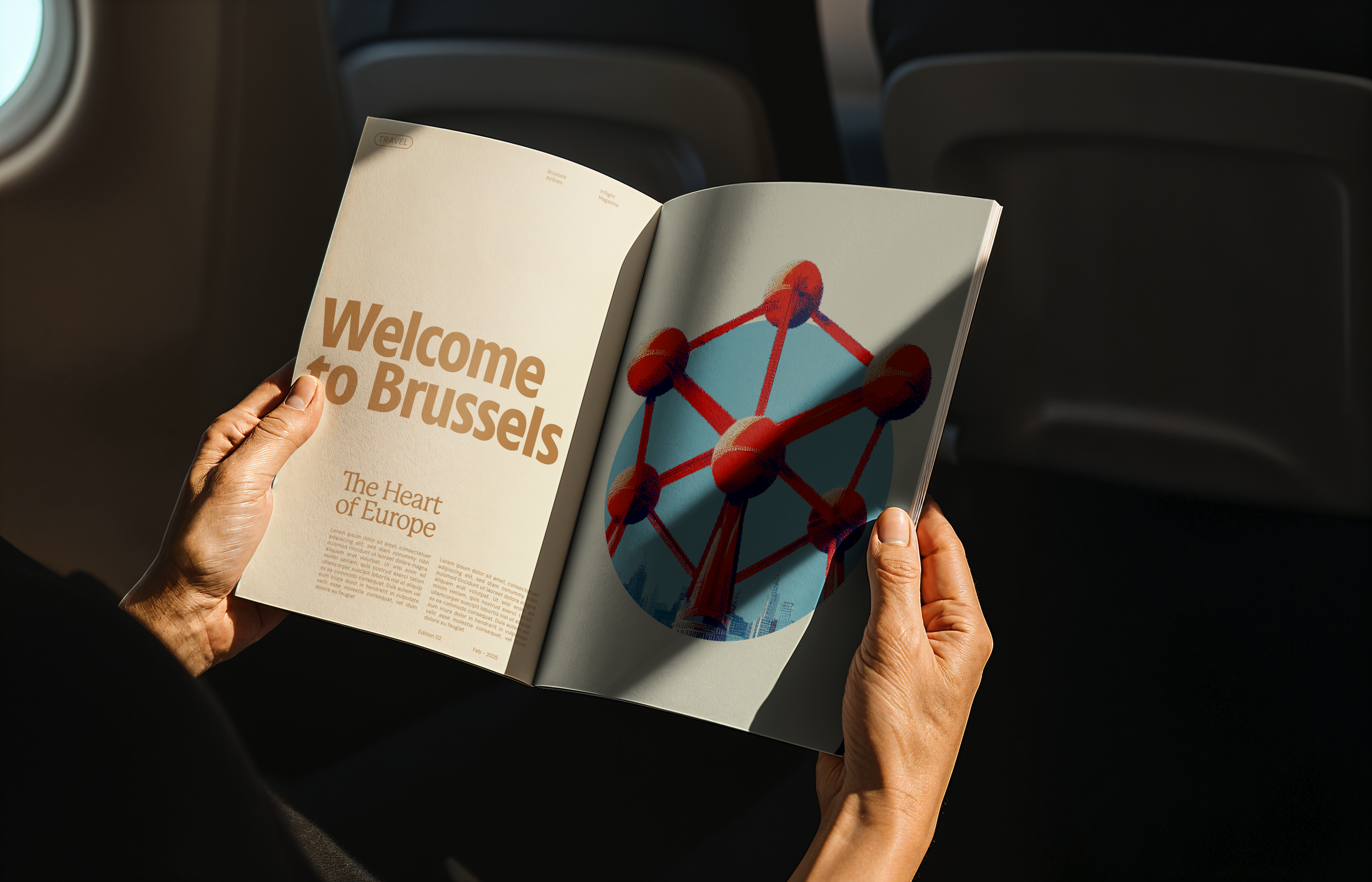
From campaigns to inflight communication, employer branding to business lounges—even the interiors onboard—this new visual language extends across every brand touchpoint. Even the airline’s own television program now embodies the renewed identity. The result? A brand that feels like a boutique hotel in the sky—refined, warm, and unmistakably Belgian.
“The real challenge was to make our brand personality genuinely tangible at every step of the customer journey. This brand refresh isn’t just a cosmetic layer in advertising, but a truly premium identity that comes to life—from cabin to lounge. Thanks to WeWantMore, we finally have a brand that resonates down to the smallest details and perfectly reflects who we are: human, welcoming, and Belgian with a playful twist.”
— Michel Moriaux, Head of Product and Brand Marketing, Brussels Airlines
“The biggest challenge? We couldn’t change the logo or the colors. But a brand is more than that. You don’t start with form—you start with an idea. You build a visual language, a system, a feeling. That’s exactly what we did: not designing a new outfit, but crafting a living identity that’s coherent, meaningful, and felt in every detail.”
— Sebastien Greffe, Creative Director, WeWantMore
Full case study: https://wewantmore.studio/branding/work/brussels-airlines
About WeWantMore
WeWantMore is a design studio with offices in Antwerp and London. As a studio, we believe progress comes from solutions we can’t yet imagine. By designing identities, products, and spaces, we give brands renewed relevance—with work that doesn’t just live in strategy decks, but is seen and felt in the real world.